

Below is a powerful look at the Devil’s Box and the gold market. Everyone invested in gold, silver and the mining space needs to read this piece.
November 3 (King World News) – Mark Lundeen: Each week, Eric King interviews Alasdair Macleod for his Weekly Market Wrap. Alasdair, I believe, is homeported somewhere in the UK. Between the two of them, King World News listeners receive an excellent overview of the financial markets, with a focus on gold, silver, and the miners of the old monetary metals.
Eric and his webmaster, Bryan have been subscribers to my weekly articles for years, and last week they published some very nice comments about my work.
https://kingworldnews.com/gold-mark-lundeen-responds-to-eric-king-at-king-world-news/
I am honored to be included with people such as Alasdair Macleod, and James Turk by Mr. King.
For years, Eric has commented on how cheap the gold miners currently are, priced to where it would be hard believing they could get much lower, especially with gold and silver rising by multiples of where they were a decade ago. Plotting the ratio of the XAU to Gold, chart below, using end of month data, Eric refers to what he calls the “Devils Box.” The Green Box to illustrate how historically cheap the gold, and silver miners are, in terms of the gold and silver they mine.
Looking at this chart, I agree with Eric 100% on that! This ratio may have been below the chart’s 10% line since 2013, twelve years now, but this isn’t a permanent situation. A day is coming when this ratio will once again trend towards its 20% line, and beyond. What that will mean for current owners of gold and silver miners, and little exploration companies like Eskay Mining, will be simply wonderful.
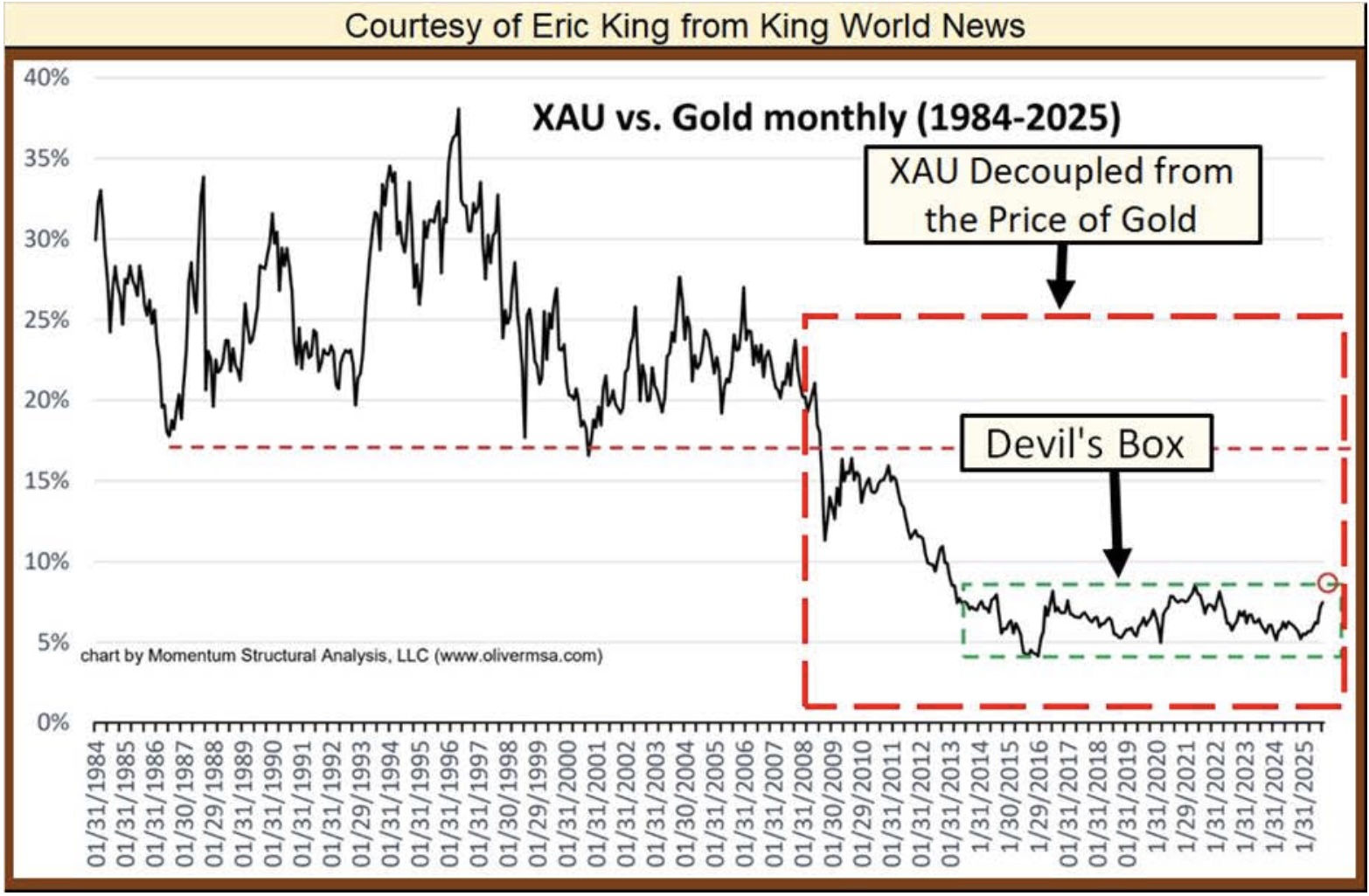
After studying this chart, I took the liberty of noting something else. Within the Red Box I placed in it, I’ve noted where the valuations of the XAU became decoupled from the price of gold.
This decoupling happened, at the beginning of a particularly dodgy episode of market history, the sub-prime mortgage debacle. Eyeballing this chart, I’d say about the time the now bankrupt Wall Street bank; Bear Stearns collapsed due to its holding of toxic sub-prime mortgage products.
Is there a connection between the sub-prime mortgage debacle, and this chronic undervaluation of the gold miners in the markets since early 2008? I can’t speak to that, other than saying that just looking at the chart above, there could be.
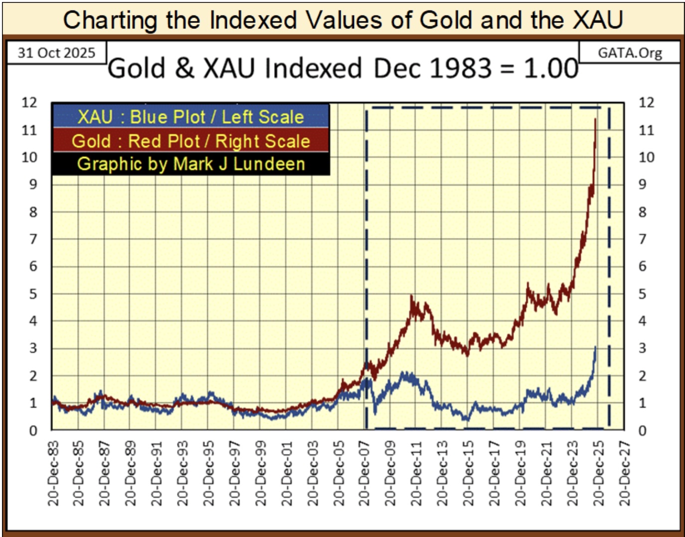
I have daily data on the XAU, and the price of gold going back to when the XAU first traded at the Philadelphia Options Exchange in December 1983. So, I thought I’d take my own look at this anomalous situation between the XAU and the price of gold, chart below, using the indexed values of gold and the XAU, indexed to December 1983 = 1.00.
For the first few decades, the relationship between gold and the XAU were closely correlated in this chart. Then something happened in early 2008, where the valuation of the XAU became decoupled from the price of gold. Could it be the March 2008 failure of Bear Stearns, when it choked on its own portfolio of toxic sub-prime mortgage assets? Maybe. But even if so, why has this situation continued for the past seventeen years?
It would take a real market expert to know the answer to that question, and I’m no “market expert.” One thing I can say with certainty is, since December 2023, when gold entered into what I call scoring position in my weekly Bear’s Eye View chart on gold, both gold and the XAU have turned up strongly, attempting to once again become; closely correlated in the chart below.
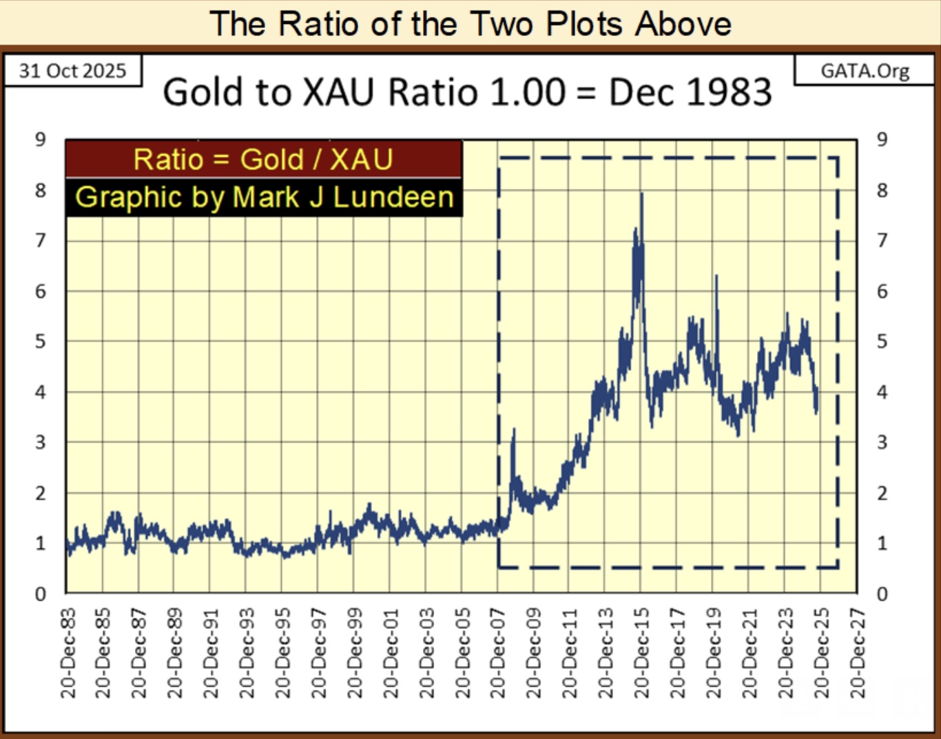
Mr. King’s chart was a ratio of the XAU to gold. So, in the chart above I thought I investigate what a ratio of gold to the XAU would do for us. Both ratios’ plots are quite similar, but inverted. So, with Eric’s chart, the lower the ratio, the more undervalued is the XAU in terms of gold. My chart above is the opposite; where the higher the ratio, the more undervalued the XAU is in terms of gold.
Currently, the ratio is around 4. Meaning should (when?) this ratio once again become closely corelated around 1, as it was before the failure of Bear Stearns in March 2008, the XAU will prove to be 400% more profitable than gold itself. That assumes our current bull market in gold and the XAU continues until this ratio once again becomes closely correlated, which I believe to be a safe assumption.
Unfortunately, the XAU only goes back to December 1983, so it lacks any insight into the 1969 to 1980 bull market in gold and gold mining.
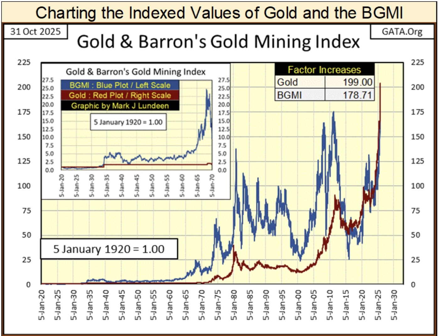
Fortunately, I have weekly data on the Barron’s Gold Mining Index (BGMI), which Barron’s has published weekly since 1938. As the BGMI in 1938 consisted of only two gold miners;
- Homestake Mining,
- Juneau Alaska Gold,
a good friend of mine (Goeff), from down under in Australia, took the time to glean weekly data of Homestake Mining from the New York Times, from 1920 to 1938. I used Goeff’s data to reconstruct the BGMI back to January 1920.
* Thank You Goeff! *
Note on gold; from 1920 to 1971, gold was considered money, more so in 1920 than in 1971. I say that as in 1920, the US Government was still minting gold coins as money, but stopped that in 1933. From 1920 to March 1934, the price of gold was fixed by law to $20.67 by the US Government. The US dollar was devalued in 1934 from $20.67 an ounce of gold, to $35 an ounce of gold.
I say that as it is important to know that at this week’s close, the dollar has been devalued by the market to $4,002 per ounce of gold. Though economists and “market experts” would say that looking at the price of gold, is a rather primitive way of valuing the dollar, something just not done since August 1971. Well, call me a monetary-caveman.
Anyway, in the BGMI chart’s insert (two charts down), highlighting the data from 1920 to 1970, gold (Red Plot) does absolutely nothing, as its price was fixed by law. And that was so until August 1971, when the US Government decoupled the dollar from its $35 gold peg.
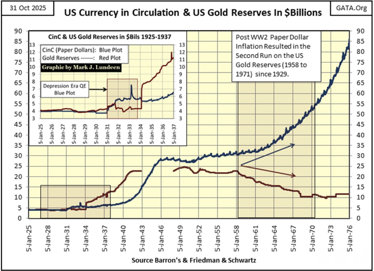
As above, with the XAU, both plots below (two charts down) are indexed, but now to 05 January 1920 = 1.00. From 1920 to 1934, they appear as if they lie atop each other. They actually don’t. But in the chart, the BGMI decoupled from the price of gold in 1934. Why? I believe it was because the US Government began implementing an unconstitutional “monetary policy” of monetary inflation, as seen below, plotting the US Government’s monetary gold (Red Plot) to its paper money; currency in circulation (CinC / Blue Plot).
Note in the chart insert below; it was during the Great Depression, that US paper money first became decoupled from the gold held at the US Treasury, legally required to back it. When in August 1971, the US Treasury announced that the dollar was being decoupled from its $35 gold peg (temporarily), it was actually a confession of the state of the dollar since 1931.
The chart below, data from the dusty old pages of Barron’s, speaks for itself. Blame President Nixon all you want for decoupling the dollar from its $35 gold peg in 1971. The unspoken fact is; since President Hoover in 1931 first printed paper money (CinC) in excess to the US Gold Reserves, every president since then, has abused the dollar for political purposes.
Sound money (gold and silver) has no friends in Washington, or on Wall Street, and hasn’t had for a long, long time!
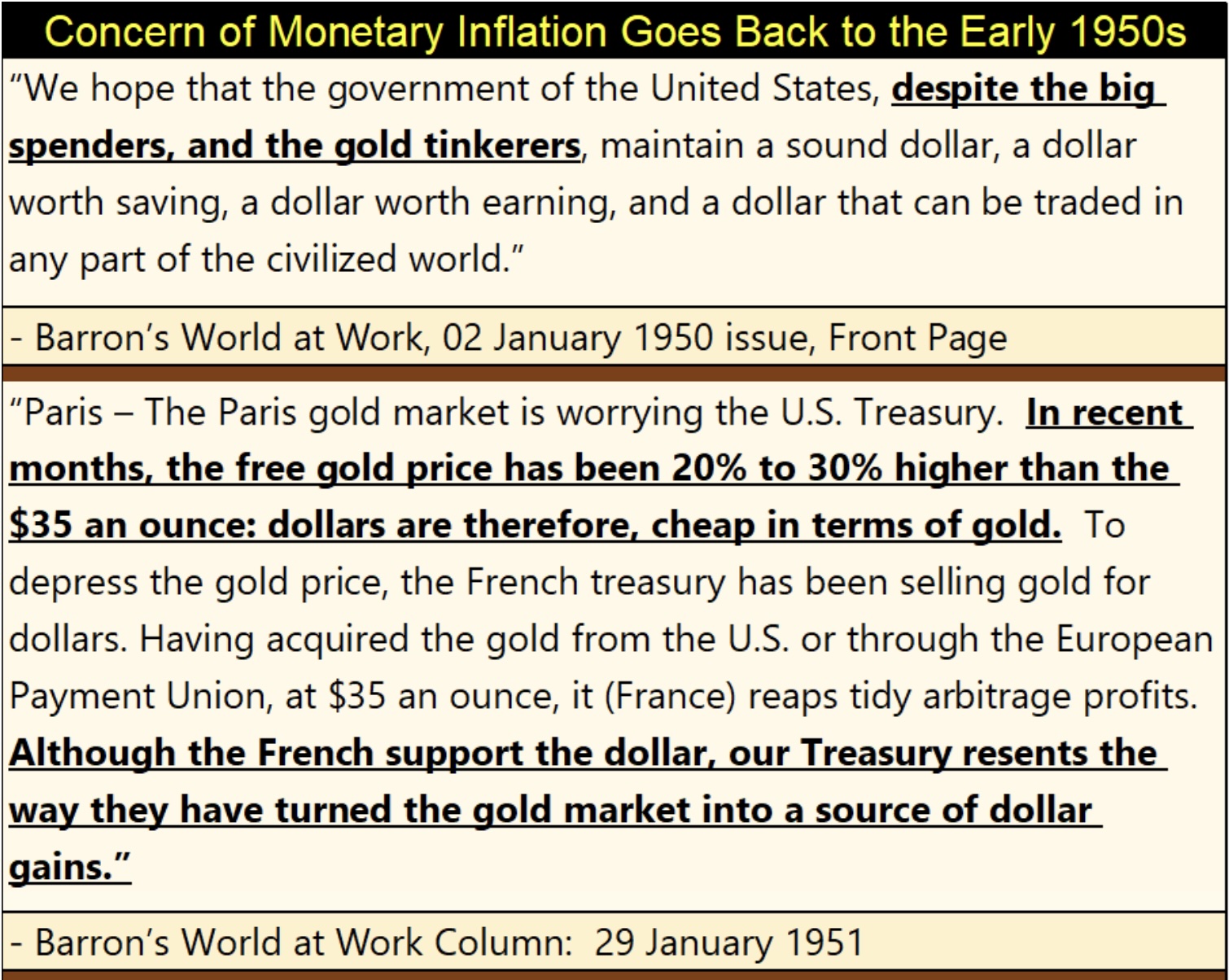
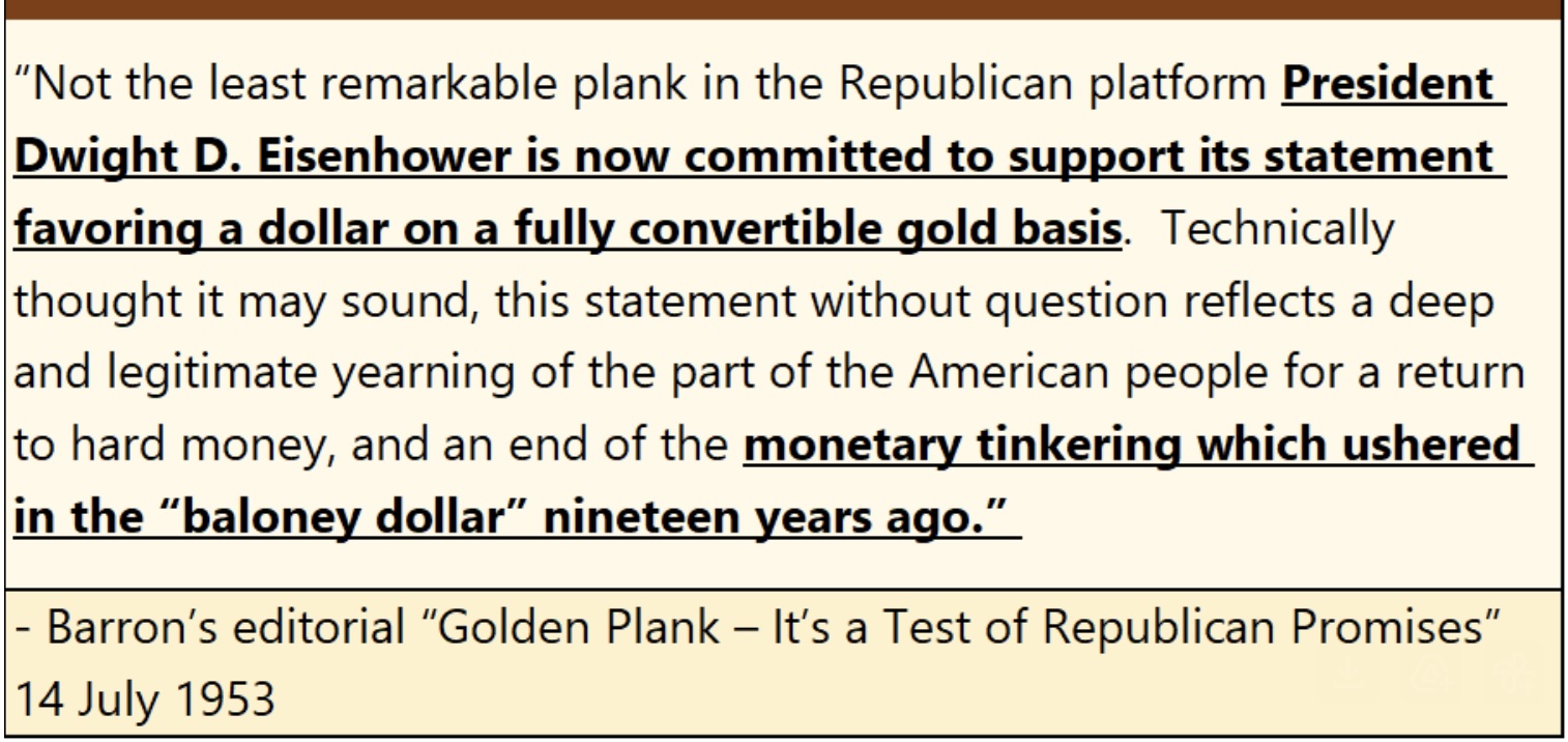
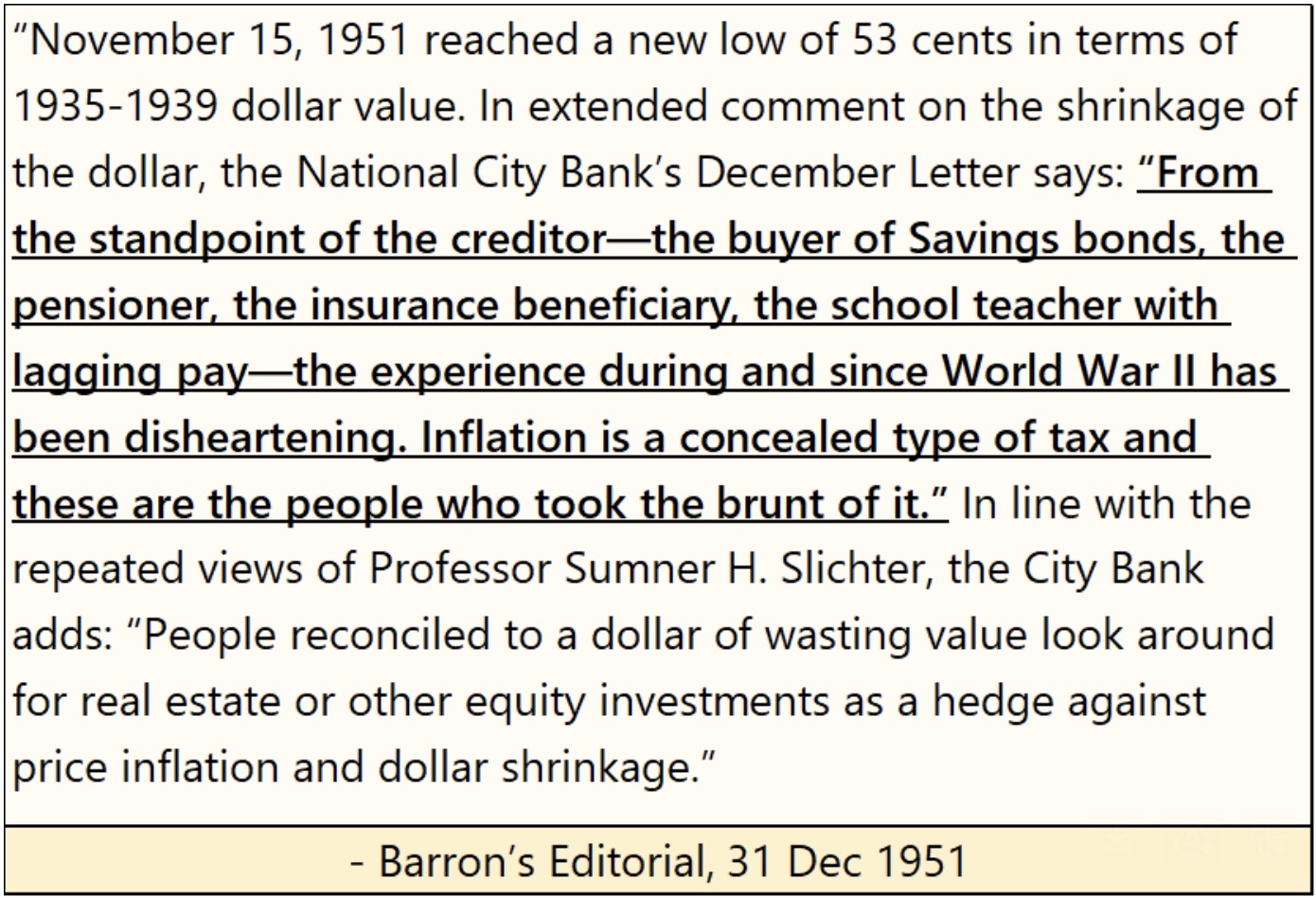
Above, paper money inflation began in earnest in 1940 (WWII), and had a huge impact on consumer prices by 1951, as seen in the quote below, from Barron’s 31 December 1951 issue.
The inflationary impact on people didn’t get any better in the years following 1951, as seen in the quote below from the Burns and Allen Television show, from 1957.
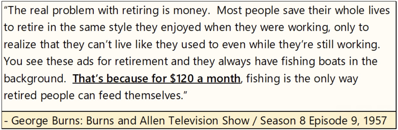
Amazing to think a retired couple in 1957, could provide for themselves with only $120 a month. How far the dollar has fallen. How much farther can it go down, and still remain money?
It took a while, but now we’ve finally come to my chart of the BGMI and the price of gold below. In the chart’s insert, we see the effect of the run on the US gold reserves that began in 1958; the valuation of the BGMI began to spike in the 1960s, far above the official price of gold.
Note too, volatility for the BGMI has increased greatly in the decades following the 1960s, up to this day. Investing in gold mining is not an easy bull for the faint-hearted to ride.
Also note that since the 1930s, the indexed values for the BGMI were always higher than the indexed value for the price of gold. That was until this past decade, when typically, the indexed value of gold was above that of the BGMI. As of last week’s close, the indexed value of gold was at 199, while the BGMI was at 178.71, a situation not seen in the chart below from 1934 to 2011; eight decades!
This inversion in these indexes speaks loudly of the current, relative cheapness of the gold and silver mining sector. That, plus when the full force of the coming bull market in gold mining once again takes force, indexes like the XAU and the BGMI, as well as the gold miners in investors’ portfolios, have a long way to run, both in terms of valuation and duration of the current bull market in gold mining.
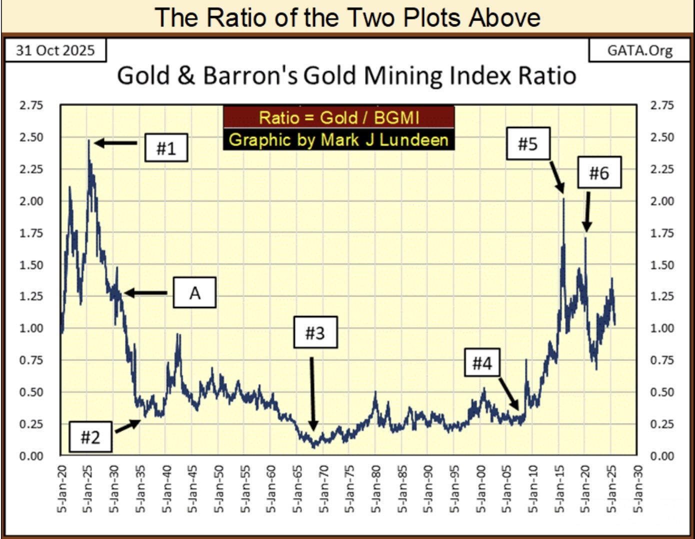
The chart above is the ratio of the indexed values of gold to the BGMI. Exactly the same as the chart Eric King provided at the beginning of this topic. Except his chart was the ratio of the XAU to gold, while above it is the ratio of gold to the BGMI.
So, in the above ratio of gold / the BGMI, the higher the ratio, the more undervalued is the BGMI to the gold these companies mine for the market.
I highlighted some points of interest to me, and I hope to my readers too.
#1: May 1925, this ratio increased to its all-time high of 2.46. Never again would the BGMI be so cheap compared to the gold these miners supplied to the market.
An interesting fact about May 1925, was also when the then new Federal Reserve extended an unprecedented line of credit to the Bank of England, of a massive $200 million. In 1925, $200 million was about 10 million ounces of gold. Today, 10 million ounces of gold at $4,002, is equal to about $40 billion dollars. Some economists argue this loan to the Bank of England was the inflationary spark that ignited the Roaring 1920s bull market on Wall Street. That sounds good to me.
#A; The September 1929 top of the Dow Jones, as it and the BGMI have been advancing since May 1925. From May 1925 to September 1929, the Dow Jones had inflated from 121.10 in May 1925, to 381.17, (an advance of 215%) at its September 1929 top. It was all downhill for the stock market after September 1929.
#2: The February 1936 top for the BGMI. The gold miners completely ignored the Great Depression Market Crash. From their May 1925 low of 3.77, by February 1936, the BGMI had increased to 50.97, an eleven-year increase of 1,252%, an advance that endured through the worse part of the Great Depression market crash.
#3: The London Gold Pool goes bust. The London Gold Pool was a central banker scheme to preserve the dollar’s $35 gold peg, in the face of the US Treasury’s unrelenting increases in the circulation of paper US dollars. See my chart above on US CinC and gold reserves.
#4: The March 2009 bottom of the sub-prime mortgage debacle.
#5: The January 2016 bottom of the 2011-16 bear market for gold, silver, and the BGMI.
#6: The March 2020 Flash Crash, where the FOMC “injected” two trillion dollars into the financial system in only two months, to “stabilize” the financial markets. Remember, in 1925 to bail out the Bank of England, the Federal Reserve only had to “inject” $200 million. How far the dollar has fallen…
Listen to the greatest Egon von Greyerz audio interview ever
by CLICKING HERE OR ON THE IMAGE BELOW.

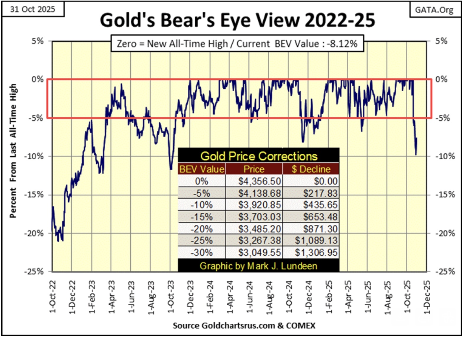
Next is gold’s BEV chart. Considering the massive advance gold has seen since it first entered into scoring position in the chart below in November 2023, seeing it now back off from its last all-time by something less than 10%, is something to be expected.
For us bulls, gold may continue going the wrong way for a while, maybe down to its BEV -15% line ($3,703.03). And then, maybe not. I’m not going to worry about the bull market in gold, not when the Dow Jones is now approaching 50,000! If someone wants something to worry about, do what I do, and worry about 50K on the Dow Jones.
My next two charts are indexes for gold and silver in the top chart, and for gold and the Dow Jones in the bottom chart.
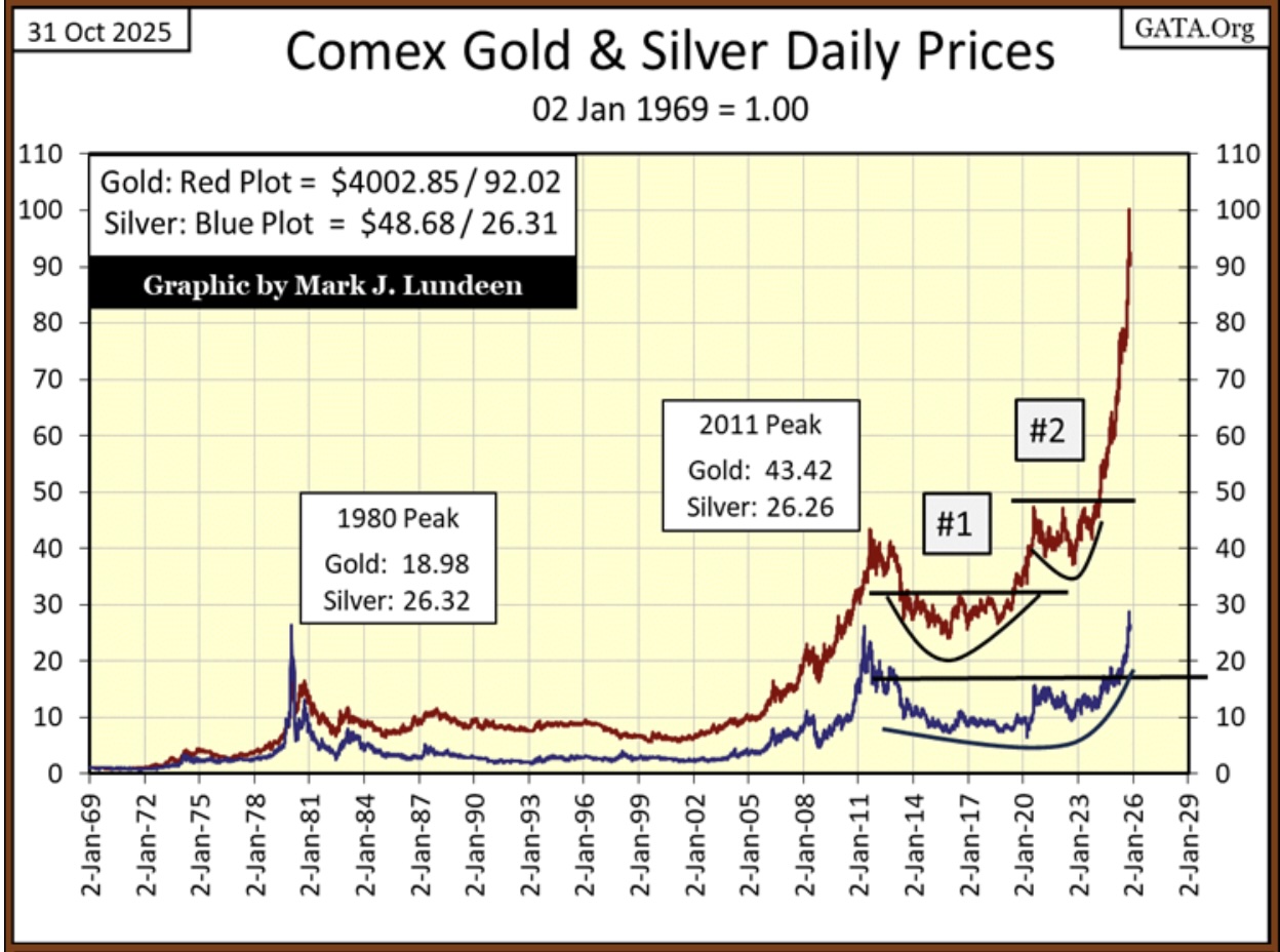
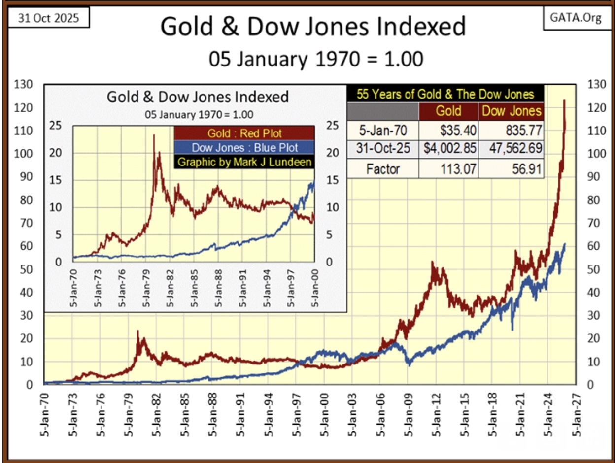
These charts illustrate the current bull market in gold and silver are doing just fine. The advance in the price of gold since 2018 has been astonishing. In the above chart, from below 40 to now over 120 in only seven years.
A pullback from these levels is something to be expected. But should gold and silver refuse to pullback, their rise may prove to be a harbinger of bad things to come in the financial markets, a flight to safety from the pending massive deflation the stock and bond markets are one day going to have to face.
On gold’s side of the step sum table below, its 15-count since the end of September was an overbought +7 to +11 for most of its daily closings. Markets don’t like being overbought, especially an extremely overbought +11 for a 15-count. So, since October 23rd, gold has only seen one daily advance.
I expect for the next week or so, daily declines will continue dominating the gold market, as gold works off that +11 seen on October 15th.
Gold’s daily volatility’s 200D M/A has increased to 0.93% on Friday’s close. That is good. All and all, gold is currently working off all those blue BEV Zeros we see in its step sum table below. I’d be surprised if gold’s advance didn’t resume by the 1st of December. Maybe even sooner.
GOLD, SILVER, MINERS: John Ing’s Must Listen Audio Interview!
John Ing is a man of great wisdom, and he discusses exactly what his contacts are sharing with him as well as where the price of gold, silver and the miners are headed and you can listen to it now by CLICKING HERE OR ON THE IMAGE BELOW.

To listen to Alasdair Macleod discuss what is happening with gold, and especially silver and the mining stocks CLICK HERE OR ON THE IMAGE BELOW.

© 2025 by King World News®. All Rights Reserved. This material may not be published, broadcast, rewritten, or redistributed. However, linking directly to the articles is permitted and encouraged.


