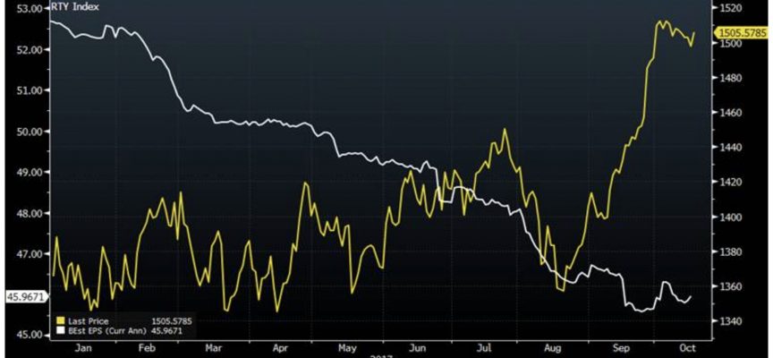
As central banks pretend stocks will stay elevated without the cocaine of additional QE, here is the WTF? chart of 2017.
Mania In Full Swing
By Peter Boockvar, author of the Boock Report
October 20 (King World News) – Here is what Peter Boockvar wrote as the world awaits the next round of monetary madness: Here is a chart of the Russell 2000 since the beginning of 2017 in yellow with earnings estimates for the components (see chart below).
WTF? Earnings estimates tumbling (white), while stocks soar (yellow)!

Bottom line, obviously only in retrospect will we know for sure what’s been priced in and what’s not but anyone thinking that nothing has been priced in I hope these figures were instructive. King World News note: This is a fantastic chart Boockvar shared which perfectly illustrates a QE-fueled mania in full swing!
***ALSO JUST RELEASED: $15 Trillion Of QE, The Stock Market, Gold And Making History CLICK HERE.
© 2017 by King World News®. All Rights Reserved. This material may not be published, broadcast, rewritten, or redistributed. However, linking directly to the articles is permitted and encouraged.


